MAKE A MEME
View Large Image

| View Original: | Woman-at-Bronte-Beach.jpg (4764x2940) | |||
| Download: | Original | Medium | Small | Thumb |
| Courtesy of: | pickupimage.com | More Like This | ||
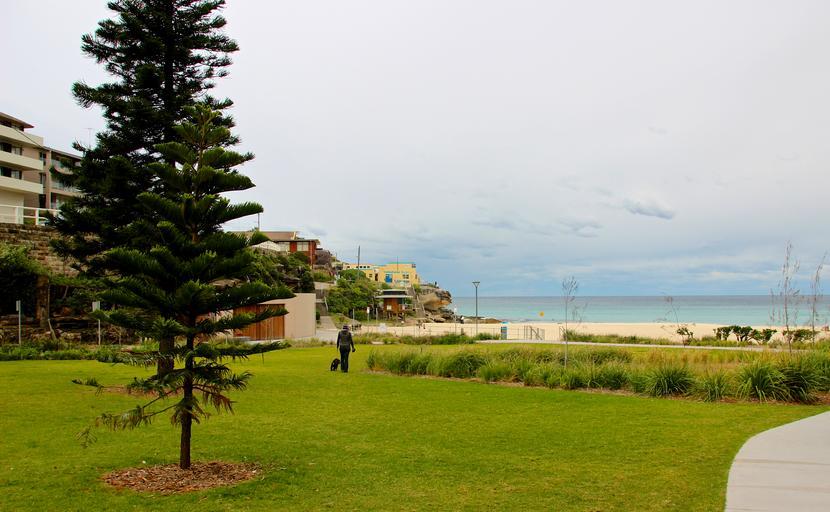
| Keywords: cc0 no copyright nocopyright outdoor Earlier today I put up the photo www.flickr.com/photos/wyncliffe/14126335915/ But it just didn't seem right to me. I looked at it a few times and decided the problem was the person on the right of the photo distracted from it. So I recropped it, this time using a lovely 81:50 ratio (within 0.13% of the Golden Ratio :-) ). I think this works a lot better. What are your thoughts? Earlier today I put up the photo www.flickr.com/photos/wyncliffe/14126335915/ But it just didn't seem right to me. I looked at it a few times and decided the problem was the person on the right of the photo distracted from it. So I recropped it, this time using a lovely 81:50 ratio (within 0.13% of the Golden Ratio :-) ). I think this works a lot better. What are your thoughts? Earlier today I put up the photo <a href="https://www.flickr.com/photos/wyncliffe/14126335915/">www.flickr.com/photos/wyncliffe/14126335915/</a> But it just didn't seem right to me. I looked at it a few times and decided the problem was the person on the right of the photo distracted from it. So I recropped it, this time using a lovely 81:50 ratio (within 0.13% of the Golden Ratio :-) ). I think this works a lot better. What are your thoughts? nocopyright cc0 | ||||