MAKE A MEME
View Large Image

| View Original: | Windmovement on weathermaps.JPG (2208x1852) | |||
| Download: | Original | Medium | Small | Thumb |
| Courtesy of: | commons.wikimedia.org | More Like This | ||
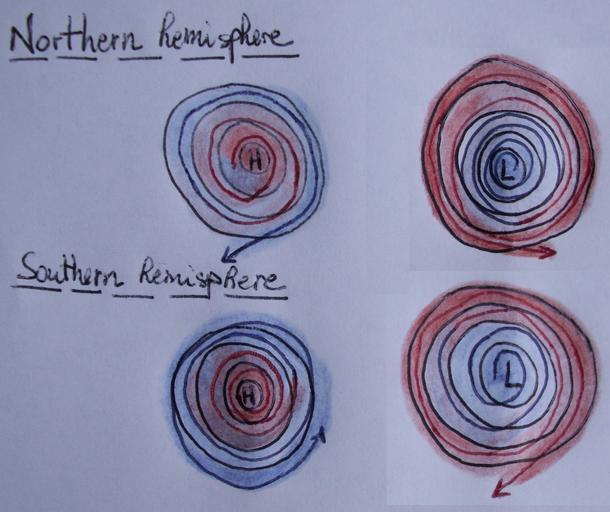
| Keywords: Windmovement on weathermaps.JPG en A incorrect schematic of a low and high pressure zone on an isobar weather map The schematic indicates the wind movement and temperature change within the zone; and this for the Northern hemisphere and the Southern hemisphere The reversed direction is due to the Coriolis effect A possible flaw in the image could be the coloring; Cold/dry air is more dense and moves towards the hotter/more moist environment where this could be colored the other way around Ask Thegreatdr at wikipedia The arrows are in any case OK however only the coloring might be flawed If incorrect make a new version of my image with proper coloring The schematic was based on a drawing in the book Sailing for dummies by JJ Isler Peter Isler Own KVDP 2009-07-28 Wind directions Cyclone diagrams | ||||