MAKE A MEME
View Large Image

| View Original: | U.S. Births by Month.svg (678x491) | |||
| Download: | Original | Medium | Small | Thumb |
| Courtesy of: | commons.wikimedia.org | More Like This | ||
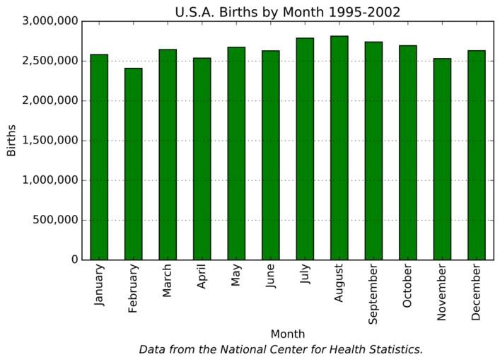
| Keywords: U.S. Births by Month.svg en A bar graph showing U S birthdays per month Data is from the National Center for Health Statistics 1995-2002 later posted to http //abcnews go com/Health/Science/story id 990641 ABC News 2016-06-09 own Douglas Perkins other versions Code <pre> /usr/bin/env python from matplotlib import pyplot from matplotlib import ticker from matplotlib import numpy This generates a bar graph showing birthdays per month Data is from the National Center for Health Statistics 1995-2002 For simplicity I have rounded it here http //abcnews go com/Health/Science/story id 990641 This file was written by Douglas Perkins data January 2582009 February 2409565 March 2645413 April 2537816 May 2673858 June 2629368 July 2788695 August 2813582 September 2740831 October 2694594 November 2532156 December 2631533 months d0 for d in data births d1 for d in data A formatter to display comma-separated numbers on the y axis def comma_func y pos s ' 0 d ' format int y return s comma_format ticker FuncFormatter comma_func Make a bar graph x numpy arange len months + 0 25 width 0 5 pyplot figure num 1 figsize 8 4 5 pyplot bar x births width color 'g' pyplot title 'U S A Births by Month 1995-2002' pyplot figtext 0 5 -0 22 'Data from the National Center for Health Statistics ' horizontalalignment 'center' verticalalignment 'bottom' style 'italic' pyplot ylabel 'Births' pyplot xlabel 'Month' xticks pyplot xticks x + width/2 0 months rotation 'vertical' pyplot subplot 111 yaxis set_major_formatter comma_format pyplot subplot 111 grid b True axis 'y' pyplot savefig 'Chapter 6 Births by Month svg' format 'svg' bbox_inches 'tight' </pre> cc-zero Birthdays | ||||