MAKE A MEME
View Large Image

| View Original: | Unreadable_Floor_Directory_Board_2.png (464x512) | |||
| Download: | Original | Medium | Small | Thumb |
| Courtesy of: | www.flickr.com | More Like This | ||
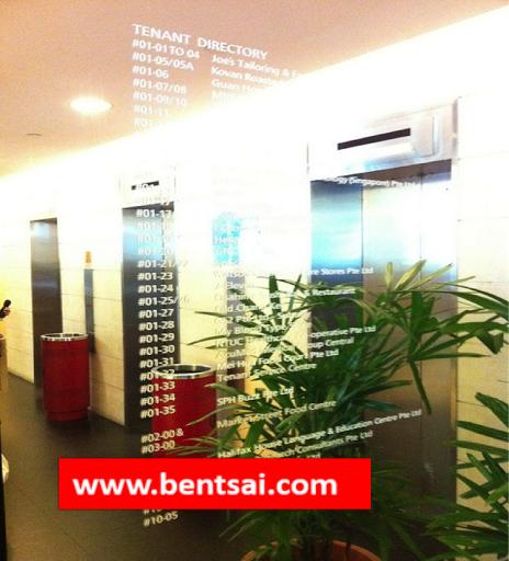
| Keywords: #Singapore., #RafflesPlaceMRTstation., #GoldenShoeComplex., The readability of the information is lowered by the plant; the reflective nature of the mirror; font size and the poor contrast & definition of the white font against the mirror. 1) The Plants prevented reader to move closer to the mirror to read the small words. 2) Mirror = Reflection Distracted me from reading the words. 3) White colored words = bad contrast with mirror. 4) Font size is too small. I am a complain King or this observation could serve as a lesson learnt for future designers / students. retail melbourne australia | ||||