MAKE A MEME
View Large Image

| View Original: | SAT-ACT-Preference-Map.svg (927x587) | |||
| Download: | Original | Medium | Small | Thumb |
| Courtesy of: | commons.wikimedia.org | More Like This | ||
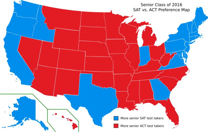
| Keywords: SAT-ACT-Preference-Map.svg en This map of the United States shows the states in which blue color more seniors took the SAT than the ACT and the states in which red color more seniors took the ACT than the SAT The blue and red colors were selected to match the logos of the College Board and ACT Inc respectively Data is for the most recent senior class Sources College Board State Profile Reports; ACT Inc State Profile Reports 2014-03-16 12 11 59 own This file is a modified version of the public domain file SAT-ACT Preference Map Erik Jacobsen http //erikthered com/tutor erikthered com cc-zero Statistical charts SAT test | ||||