MAKE A MEME
View Large Image

| View Original: | Inconspicuous_Sign_may_get_shoppers_trapped_in_dead_end_corridor_during_fire.jpg (960x720) | |||
| Download: | Original | Medium | Small | Thumb |
| Courtesy of: | www.flickr.com | More Like This | ||
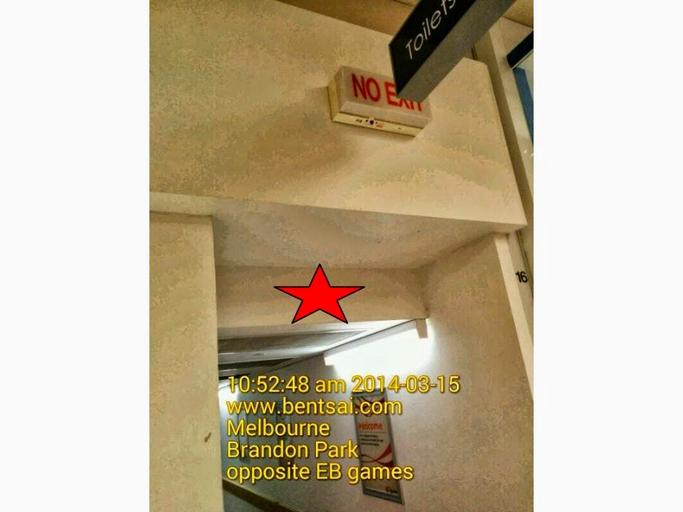
| Keywords: retail melbourne australia The "No Exit" sign is installed too high up and is obstructed by the black toilet sign. I wish the "No exit" sign could be installed in the red star location on the photo thus making it conspicuous and easy for shoppers to locate the sign. This would prevent shoppers from running into a dead end and get trapped in the burning building in the event of a fire. Nothing may change due to interesting reasons. I hope designers and architects could learn from this feedback to design and install better signs positions for the emergency escape route of your loved ones. retail australia melbourne | ||||