MAKE A MEME
View Large Image

| View Original: | Flickr_Redesign_is_Bad!.jpg (3264x4928) | |||
| Download: | Original | Medium | Small | Thumb |
| Courtesy of: | www.flickr.com | More Like This | ||
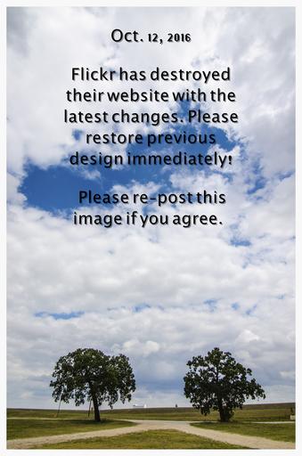
| Keywords: flickr bad design redesign protest outdoor You now have to go 2 levels down from Flickr homepage just to add a photo to a gallery. You have to click on a photo and open it just to star (fave) it. They've made the experience of browsing through other's photos just miserable. The notifications count is also annoying that it can't be turned off. You now have to go 2 levels down from Flickr homepage just to add a photo to a gallery. You have to click on a photo and open it just to star (fave) it. They've made the experience of browsing through other's photos just miserable. The notifications count is also annoying that it can't be turned off. | ||||